https://vuetifyjs.com/en/components/ratings/
Rating component
The star rating component is a specialized widget for collecting user feedback via ratings.
vuetifyjs.com
vuetify의 v-rating 컴포넌트는 mdi-icon을 사용하면 아주 편리하지만, custom icon을 사용하기에는 까다롭다.
본 포스팅에서는 v-rating에서 custom-icon을 사용법과 size 조절까지 알아본다.
1. custom icon 적용
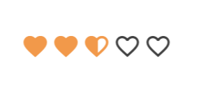
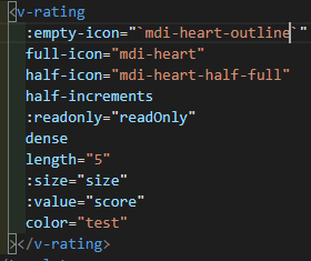
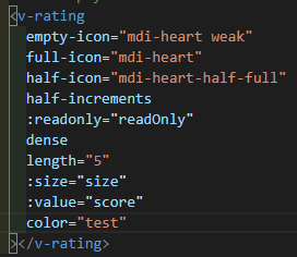
위 코드 처럼 평범하게 작성하면 v-rating이 위와 같이같이 나온다(색상은 무시해달라). mdi-heart-outline(mdi-icon)으로 지정된 empty-icon을 연한 heart(custom-icon)로 만들고 싶다고 가정하고 설명을 진행하겠다.
아래와 같이 코드를 수정하고
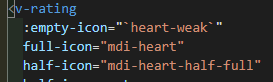
css를 추가한다
.heart-weak::before {
content: url('~assets/icon/weak-heart.svg');
width: 16px;
height: 16px;
}
.heart-weak:before,
.heart-weak-set {
display: inline-block;
font: normal normal normal 24px/1 'Material Design Icons';
font-size: inherit;
text-rendering: auto;
line-height: inherit;
-webkit-font-smoothing: antialiased;
-moz-osx-font-smoothing: grayscale;
}
content: url로 아이콘 파일을 가져오고 width와 height로 조절하면된다.
.heart-weak:before,
.heart-weak-set
는 기본적으로 v-rating이 사용하는 css 부분을 복사하였다.
그러면 정상적으로 icon이 출력된다!
2. custom icon 사이즈 조절
다만 위의 코드는 css content로 이미지를 넣기 때문에 사이즈 조절이 불가능하다. 또한 v-rating에 props로 넘어가는 size와 일치시키는 것도 힘들다

따라서 코드를 다음과 같이 변경시킨다.
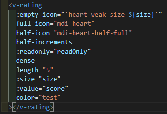
다음 css를 추가한다
.size-16 {
display: flex;
justify-content: center;
align-items: center;
box-sizing: content-box;
background-image: url('~assets/icon/weak-heart.svg');
background-size: 16px 16px;
width: 16px;
height: 16px;
padding: 0.1rem;
top: 1.6px;
left: 1.6px;
}
.size-32 {
display: flex;
justify-content: center;
align-items: center;
box-sizing: content-box;
background-image: url('~assets/icon/weak-heart.svg');
background-size: 32px 32px;
width: 32px;
height: 32px;
padding: 0.1rem;
top: 1.6px;
left: 1.6px;
}
v-rating에 넘겨주는 props들도 결국 class의 이름이기 때문에, 원하는 class를 동적으로 전달하고 (size-${size}) 해당 class에 맞는 css를 작성한다. 이 때, size 변경을 위해서 background-image를 사용하고, 이에 따른 디테일을 잡는 코드가 추가된다.
그러면 정상적으로 출력되는 custom-icon을 확인할 수 있다.
3. Tip.
사실 위와 같은 상황에는 다음과 같이 적용하는 것이 올바르다.
다음 css만 추가
(.accent--text가 없다면 vuetify가 기본으로 설정한 검정색이 적용된다)
.accent--text.weak {
color: #f2984a27 !important;
caret-color: #f2994a27 !important;
}
정리
custom-icon이 필요하면서
- 사이즈는 고정일 때: 1번 방법
- 사이즈도 변할 때: 2번방법
- ※ mdi-icon에서 색상만 변경할 때: 3번 tip
'Programming > Vue.js' 카테고리의 다른 글
| [HTML] select tag의 style 변경하기 (0) | 2021.10.17 |
|---|---|
| [Nuxt.js] nuxt.js에서 vue-echarts 사용하기 (0) | 2021.10.15 |
| [Vuetify] v-data-table eslint에 맞춰서 사용하기 (0) | 2021.09.30 |
| [Azure Storage] Vue.js에서 Azure Storage로 blob 업로드 하기 (0) | 2021.08.20 |
| nuxtjs/auth-next 설치 (0) | 2021.05.23 |